Assessment Drawings
Photography/composition assignment: Photographed an object of choice using different angles and filters

|

|


|


|


|
Value Chart: Created a value chart utilizing different pencils and shading techniques

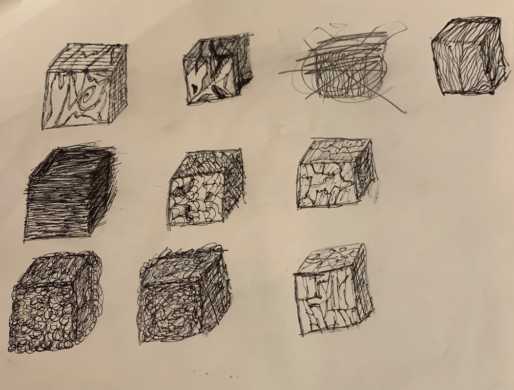
Shaded Forms: Created four different shapes utilizing our new shading techniques as well as creating accurate light deposites

Brainstorming Ideas
- Drawer of old candles
- Makeup holder
- Dried rose in small vase
- Closet of clothes
- String lights
- Coat rack
- Desk filled with old baby photos
- Book shelf
- Knick knacks on desk
- Curtains
- Bed side table with random items
- Cabinet of random fun mugs
- Horseback riding ribbons in a bin
- Old stuffed animals
- Box of beads
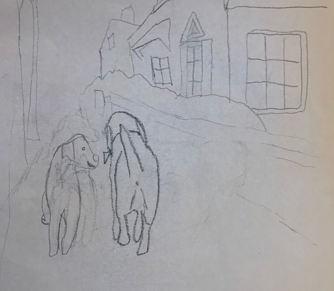
Reference Photos

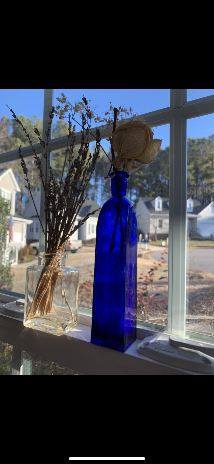
|

|
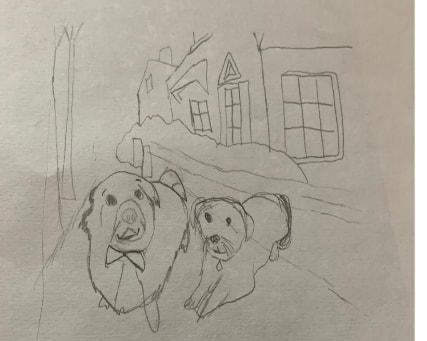
Compositional Sketches
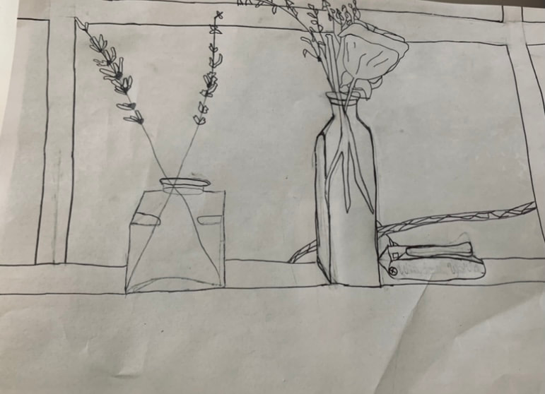
|
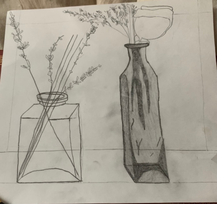
Final Sketch

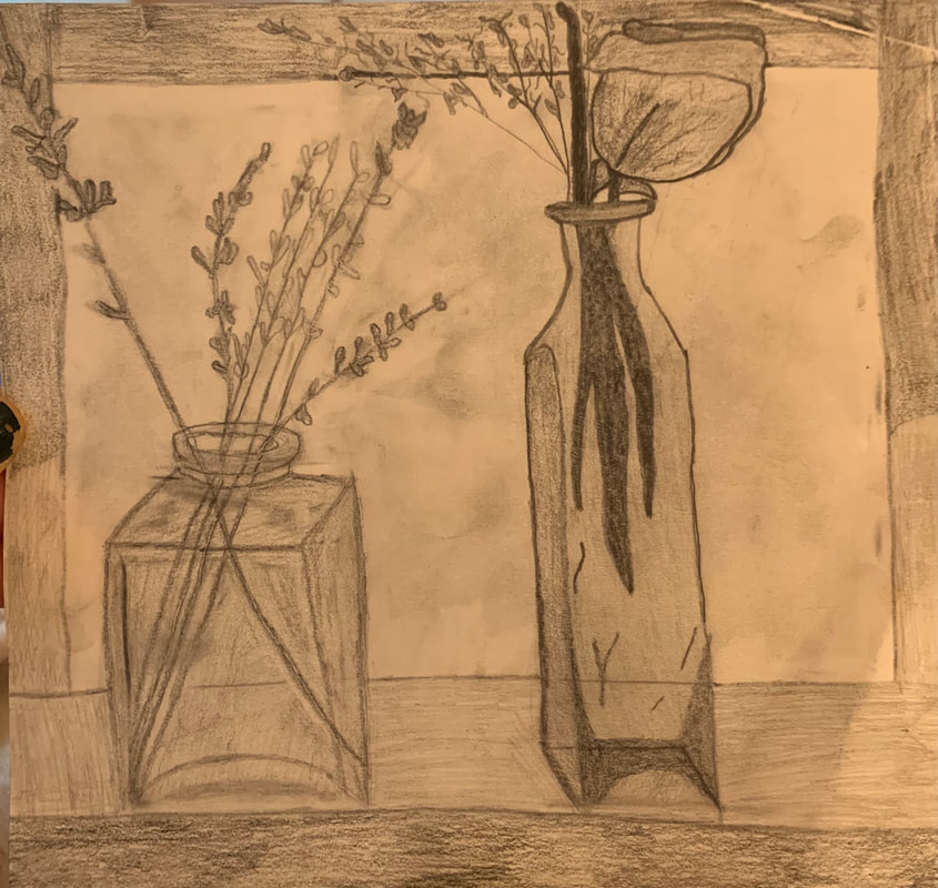
In Progress Photos
|
|
|
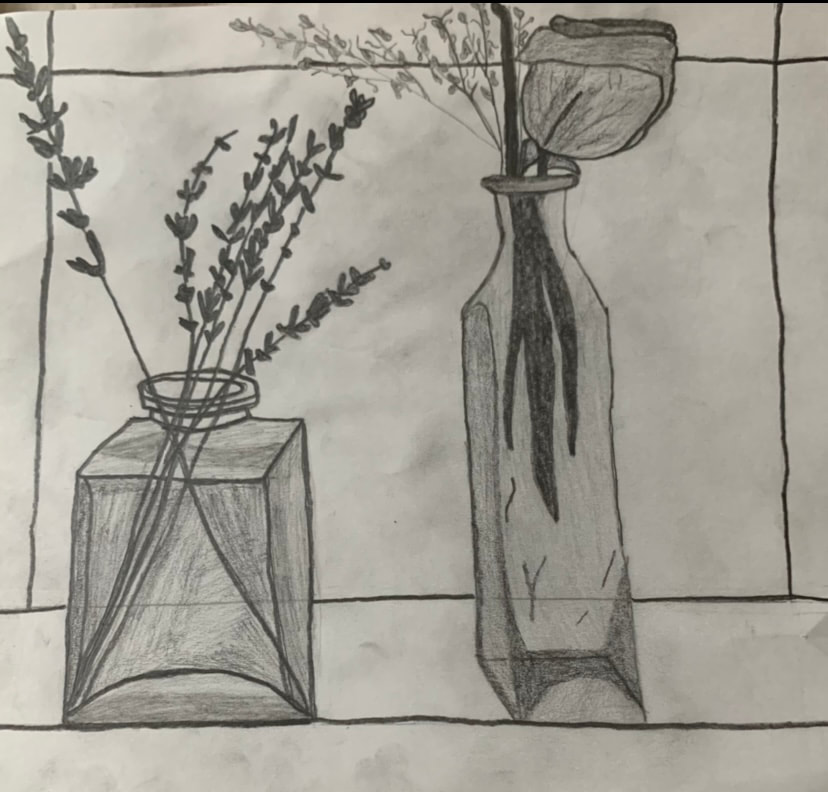
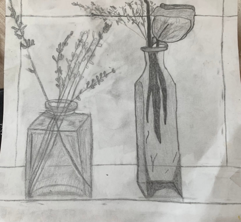
Final Drawing
Critique Question
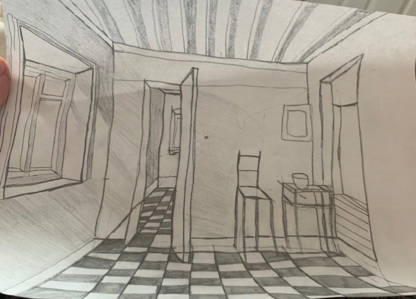
To develop my drawing I first began sketching my flower picture. After I had decided on the sketch I liked best I then started planning a final sketch that I would begin shading. After I had my final I shaded different areas according to different lighting, colors, and shapes. Soon I had completed my piece and submitted it as my final. Composition was very important to the success of my drawing. Creating a geometrically proportional piece was vital to having a final that looked accurate and clean. Finding the values in my work was a little difficult as there were so many different places hit by different lightings. This is because it was set up in front of a window. I had to pay close attention as I shaded and be sure the pencils I was using were effective. I believe my works craftsmanship was good but not outstanding. I originally created my lines much too thick meaning I had to erase a good bit. This created some smudging and took away from the overall piece. Learning the skills was somewhat important before making my piece. Knowing the correct pencils to use was extremely necessary but I feel that the shading was something that I had to experiment with rather than try to learn methodically. This assignment grew me in my knowledge of the different shading techniques as well as correct pencils to use. The biggest challenge for me was creating too much of an outline rather than just being light and relaxed with my pencil.
Pen unit: Pen tutorial drawings
1 Point perspective
|
|
2 Point perspective

3 Point perspective


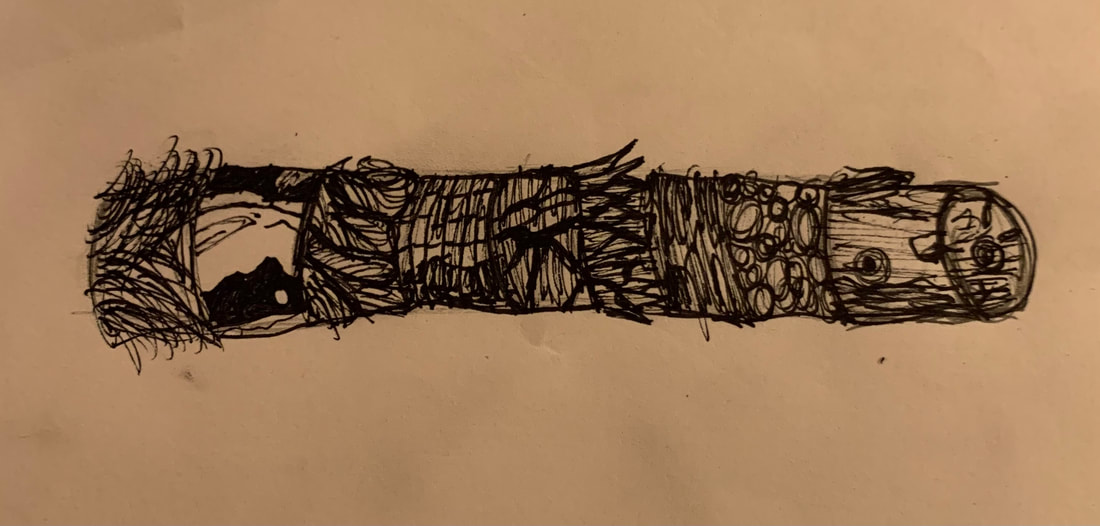
Pen value chart

Pen stippling worksheet

Pen perspective project
Brainstorming ideas
- Ariel swimming up to the sun/top of ocean. You can only see the back of her tail/head and the light cascades down the picture.
- The beast from behind looking into a mirror and the reflection of the man he truly is shown in the mirror
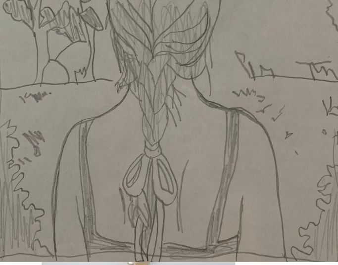
- Rapunzel braiding her hair from the back and the hair that isn’t yet braided swirling around where she sits
- The witches hand gliding over a recipe to cook the children (hanzel and gretel)
- A group of perfectly normal eggs and one misshapen and ugly looking one (the ugly duckling)
- Merida’s bow laying next to her on her bed as she sleeps grasping it
- The glass slipper showing a reflection of cinderella running away
- Humpty Dumpty splattered on the road (this one is kinda dark haha)
- The lady and the tramp walking away with their tails in the air intertwined almost like holding hands
- Hogwarts school with three witches and wizards flying overhead and a lightning bolt striking the other side
- Little red riding hood’s hood hung up and dripping mud
- Moana’s grandmother (stingray) from above illuminating the ocean surrounding her
- A strand of long hair sticking out of mulans hat while she pretends to be a boy
- Alice from behind opening a bush and through you see wonderland and its magical creatures
- Goldilocks in the bears bed (looking through window perspective)
- Tiana’s hand with the frog in it and a red lipstick kiss on his cheek
- Rapunzel with her locks in her hand after they come out (can only see hands and torso not her face)
- Olaf smiling reading a beach magazine in the snow
- Harry potters forehead and lightning strike scare, his hand is holding back that section of hair
- Tinkerbells torso and body with her hand holding a bag of pixie dust
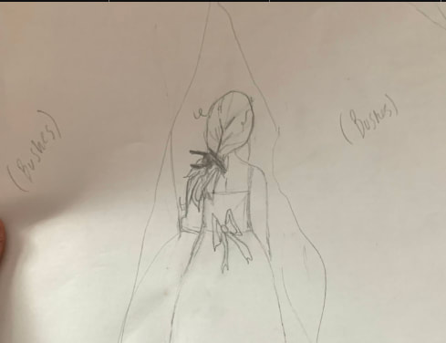
Compositional sketches
|
|
|
|
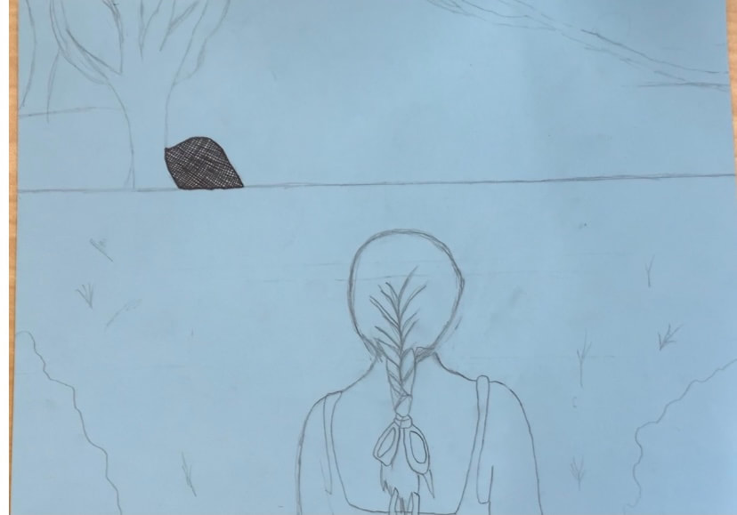
In progress photo
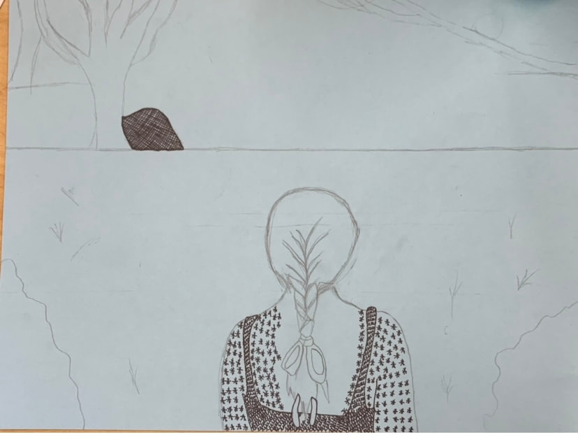
Final drawing
Self reflection
For this project I mainly utilized the stippling technique. I chose this because you can make things deeper, lighter, and even textured. It is a very simple technique as you just dot a large amount of times in the same place. I used perspective to show a back view of Alice. Perspective is important because it can offer a new view on a picture other than straight on. Texture is also important in my composition. Texture offered a way for me to show the girls hair, bow, and the trees in a realistic light. Value is important as well because it depicts light in an artwork. If I could recreate my piece I might add more to the center of the scene. It was very important to apply the ink techniques we used in class because they describe how to make a successful piece. I think this project has grown me as an artist as I have never worked closely with pens or stippling. This work has expanded my knowledge and tools.
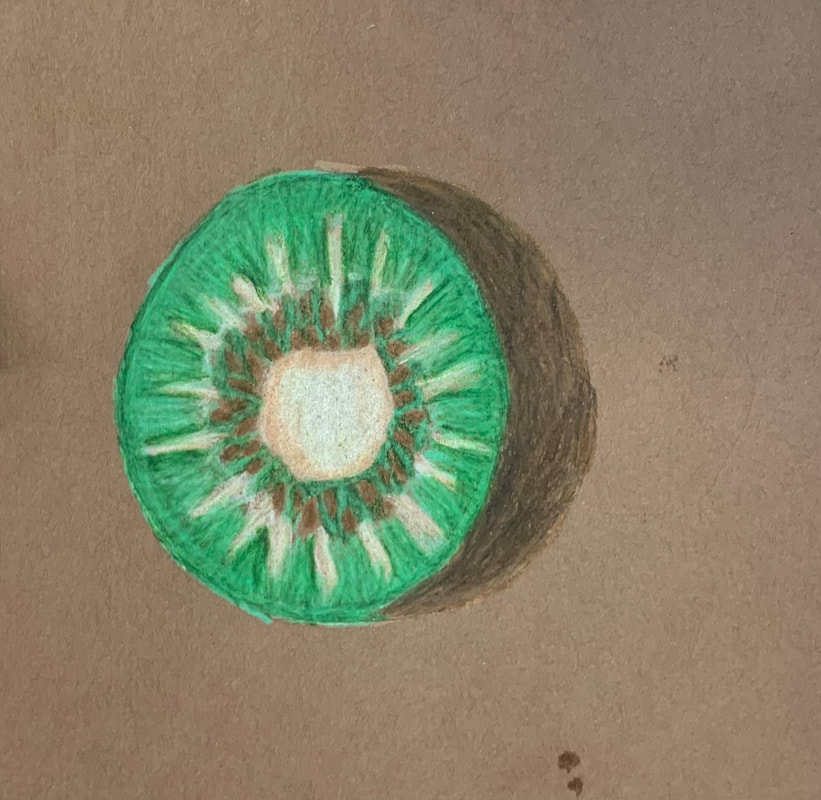
Colored pencil fruit/veggie
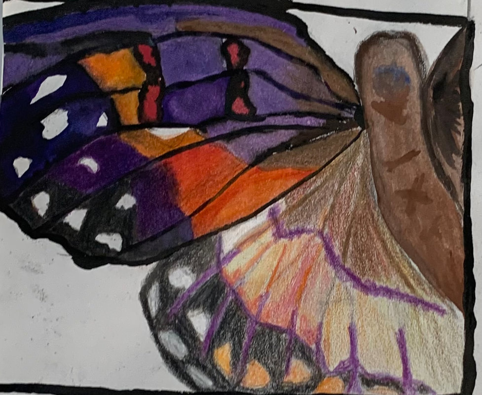
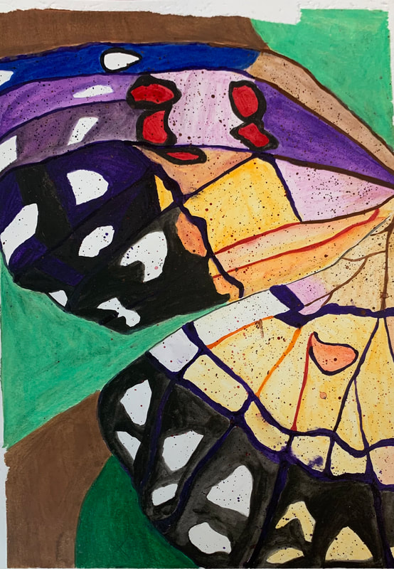
O'keefe project
Brainstorming ideas
- Forget me nots in a field up close
- The pattern on a butterfly wing
- Queen anne’s lace up close
- Split rail fence and wildflowers growing underneath
- Up close on a sunflower with a bee buzzing around it
- Dandelion with its flowers floating away in the wind
- Rock pile in a stream
- Sunset shining on blades of grass
- Green strawberries on a plant
- Side of horses face with eye open
- Horse walking away with picture straight on
- Blades of grass with sun shown through them
- Peacock feather
- Behind a waterfall
- Bowl of fruit with a fly buzzing around it
Compositional sketches
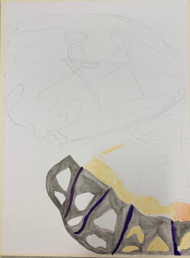
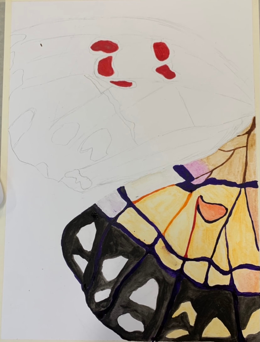
In progress photos
Final painting |
|

|
Reflection question
The most effective watercolor technique was using the water color pencils and doing small sections at a time. It was very important to use transparent layers for my painting because it provided a depth to my work. My composition was succesful because. The color choice of my work was very important to the overall success of my work. This is because different shades had a big impact on the amount of shading I could do with the prisma colors over it. With much darker colors I wasn't able to do much after it dried so I had to use them sparingly. Georgia O'keefe affected the work I chose to depict in my painting. I feel like butterfly's are a very natural choice and her work is generally of nature. If I was an art critic I would probably say my work was well sketched and planned but could use a more diverse coloring on lighter sections of the wings. If I was able to change something about this work I would adjust the amount of black I used on the top wing. This is because I feel that it draws too much attention and lacks depth. This project has taught me about painting with watercolor which is something that has always made me nervous. This is because it felt too uncontrolled but I have learned that with different brushes, pencils, and resources you can achieve a controlled work.
The most effective watercolor technique was using the water color pencils and doing small sections at a time. It was very important to use transparent layers for my painting because it provided a depth to my work. My composition was succesful because. The color choice of my work was very important to the overall success of my work. This is because different shades had a big impact on the amount of shading I could do with the prisma colors over it. With much darker colors I wasn't able to do much after it dried so I had to use them sparingly. Georgia O'keefe affected the work I chose to depict in my painting. I feel like butterfly's are a very natural choice and her work is generally of nature. If I was an art critic I would probably say my work was well sketched and planned but could use a more diverse coloring on lighter sections of the wings. If I was able to change something about this work I would adjust the amount of black I used on the top wing. This is because I feel that it draws too much attention and lacks depth. This project has taught me about painting with watercolor which is something that has always made me nervous. This is because it felt too uncontrolled but I have learned that with different brushes, pencils, and resources you can achieve a controlled work.
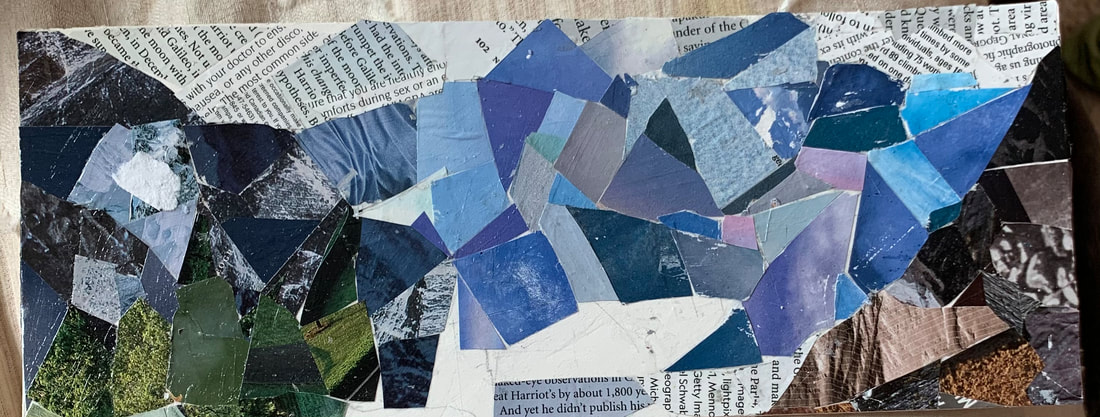
Collage project
Brainstorming ideas
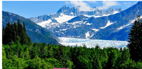
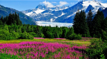
- An Alaskan landscape
- An old castle in Ireland
- The ocean with a wave crashing down
- The amazon river flowing
- Buckingham palace
- Hoover dam
- Eiffel tower
- Yellowstone park
- Grand Canyon
- Colorado hot springs
- Pompeii ruins
- Oregon
- Vermont fall landscape
- Scottish highlands
- New York
Reference photos
Final work
Self reflection
I chose my subject matter because of the different textures of the landscapes as well as the colorings. The proportions I crafted feel appropriate and I feel they turned out well. I used texture through my incorporation of words as the sky. This gave it a better depth. I also used a mixture of solid and textured pieces of magazine to create the mountains. I decided on my shapes through trial and error. I do feel that I used a good amount of values to reproduce my photo. Though I could always improve. I feel my artwork was somewhat neatly crafted though some places are a bit rougher than others. If I was to redo this project I would find ways the make more clear distinctions between the mountains and foreground.
I chose my subject matter because of the different textures of the landscapes as well as the colorings. The proportions I crafted feel appropriate and I feel they turned out well. I used texture through my incorporation of words as the sky. This gave it a better depth. I also used a mixture of solid and textured pieces of magazine to create the mountains. I decided on my shapes through trial and error. I do feel that I used a good amount of values to reproduce my photo. Though I could always improve. I feel my artwork was somewhat neatly crafted though some places are a bit rougher than others. If I was to redo this project I would find ways the make more clear distinctions between the mountains and foreground.
